Ok so before some more serious stuff, I just wanted to show this little gem I found while walking into Uxbridge. Sprayed onto a traffic bollard, a small zebra. It must have been done with a stencil, but it is just a small example of how graffiti can be fun and just add that extra little bit of cheer in what could have been a gloomy day, luckily it wasn't, but it just shows what graffiti should and could be like, small, unobtrusive and fun.
Anyway, I've been doing more work this weekend, working on my project for Graphic Communication, and although I don't want to spoil too much, here is a little taster of the direction I have decided to take for this assignment.
And finally, an interesting little piece of information I learnt is that statistically, I am the
80,676,055,781th
person to be born....ever. The 5,592,912,904person alive at the time.I learnt this from a UN website called 7 billion and me, which is counting down the number of births until the total reaches 7 billion, which is going to be very soon, because as of writing this it is already on 6,999,887,011. You can type some basic demographic information into this website and find out a load of statistically based fact, such as that for me 2,539,378,636 people have been born since me, 1,032,405,962 have died and that I share a birthday with 366,682 other people worldwide, grrrr. So that's quite neat. Oh and just to let you know, since typing the current total, it has gone up by over 700 more people!
So Friday is Design Process day. And after a lecture on historical design styles, such as Art Nouveau, Art Deco, Bauhaus, Streamlining and Post-Modernism, we got to do some 3D sketching also known as model making in Pink Foam. The item I am making is the first part of the assignment I mentioned earlier. The brief is to take an ordinary item, in this case a mug, and apply a historic design style. The style I have chosen is called Deconstructivism. Seen most prominently in architecture, it dismantles the preconceived shapes of a building an turns them into flowing curves and abstract shapes, such as with the Guggenheim Museum in Bilbao designed by Frank Gehry.
So that is the sort of effect I am trying to establish here with this mug, which as you should be able to guess, is unfinished, but I still have another four hour session next week where I will be able to finish it off. Below is a picture of the tools and materials I used to get this far, I also used a hot wire cutter to establish the basic shape.
After the workshop I attended a rapid visualization workshop, run by three third years who had spent a term studying rapid visualization in San Fransisco University for their placement year. The workshop concentrated on breaking objects down into basic rectangles and cylinders, using the example of a DLSR camera shown below.
The first task was to simply establish the basic shapes around a photocopy of the camera itself and extracting from that different views (above). After that we had to recreate the camera from scratch without using rulers on A3 layout paper. With my version I am very happy with how the body turned out but I messed up with the proportions of the lens, but still not bad for a 15min job.
Anyway that's all for today, more stuff tomorrow, bye.
Today was the usual Thursday, lots of lectures with lots of maths (Mathematics, Electronics and Mechanics). But anyway tommorow should be interesting as after a lecture in the morning we will begin working on our next assignment, which involves mking models out of blue foam. The firsat part of the project is to make an everyday item in the style of a historic design style or movement, but more on that later. The other half of it is to make a copy of an everyday, desktop sized item, however it must be copied only from a 200 word description, no seeing the actual object. So this will be done in pairs with each person providing an object description to be made. This is the description I will be giving to my partner, see if you can guess what it is or looks like.
A rectangular object with a single line of symmetry down its length. It is 14cm long, 5cm high, 5 cm wide; all the edges have been heavily rounded, especially on one of the end faces, the front of the object where the face is almost spherical. On this front end is a rectangular sheet of embedded plastic shaped to the front end, 2.5 cm high, 3.5 cm wide. On top of the object is a slightly domed length of matte material, echoing the outline of the object 10cm long and 3cm wide and placed towards the back of the top face. Towards the front of this surface is another glossy dome, shaped like an inverted tear drop, 6cm long, 2cm wide. Towards the front of this is a small oval matte dome, 2cm long, 1cm wide. 2/3 from the bottom of the object, on each side is a strip of matte material, 7cm long, 2cm high, moulded into 5 horizontal bulges, the last edge of which is 2cm from the back edge. On the bottom of the object is a strip of raised material 11cm long, 0.5 cm high, 3.5cm wide at its curved front edge, tapering to 2cm on the bottom back edge of the object, with a rectangle 2.5cm wide, 1cm long and high, placed on the material in a space cut out from the main object.
Any ideas? When the model has been made by my partner I will show their model and reveal what the actual object is.
Brunel University has the brand 'Made in Brunel' for the exhibitions of student work arranged by the university. A new year, a different look for the brand and part of that are new t-shirts.
So to save on effort, or give the students a chance to enter a competition and add to their portfolio, they have made it a competition for design, engineering and fashion design students. The only conditions to the brief are that it has either a black, grey or white base, only uses the colours orange, grey white and black, and it must have the Made in Brunel logo on it. So these below are some designs I have done for this. Click on the designs for details.
So hopefully the judges will like it, the deadline is 1/11 so still time more more ideas.
Today was back to Graphic Communication and after a lecture on colour theory, it was up to the computer labs to do more work in Photoshop. Still being somewhat unsure as to what I should do for my final artifact I returned to my idea of the speaker light.
The two images above were made by manipulating the layers of the original image below, and by adding some more images in the form of the speakers. This creates more views which should better explain the function and workings of the speaker light.
The other bit of excitement today was the arrival of my new printer. By arrival I mean a small pink slip saying to go to the distribution centre and carry it back to my flat, about a ten minute walk away. But anyway, its a Canon Pixma iX6550 so I am now able to print both A4 and more importantly A3 sheets. Also it looks awesome. I honestly thought when I got it out of the box it was something from a science-fiction set.
So I'm now able to print off all the various timetables and rotas that I have been given, which is a lot. But anyway a free day tomorrow so I can get more work done.
Today I went to the London Design Museum to see an exhibition on Kenneth Grange called Making Britain Modern. It is towards the end of the exhibitions display and after a couple of failed attempts to go (closed train lines) I went today with one of my flat mates.
The exhibition displays a catalogue of Kenneth Grange's work, from his first designs, a poster done in primary school to his most recent. Below are some photos from the exhibition showing some of his work,
Initial rapid visualization sketches and models of an early Kodak camera and a set of clocks and thermometers.
Sketches for the UK's first specific Parker pen (before they were only American models with small adaptations) designed for students and some other designs including a clock.
A nice coincidence was that he worked with developing the style of Wilkinson Sword Razors over many years, the same brand of razor that I sketched as part of my Design Process Assignment, unfortunately he has now stopped designing for them so did not design the specific razor I sketched.
A large range of Kenwood appliances that he designed. The model on the left is very unusual as he was given only a few days to create the model and, knowing he did not have enough time, created exactly half the model and presented it with a mirror behind it to create the other half (the ingenuity for which was appreciated by the client).
He also designed the iconic Intercity 125 train. He was initially only commissioned to design the colouring and look of the exterior, however he realised that the shaping of the exterior could be both more aerodynamically and aesthetically designed so, after testing various models at night in the Imperial College's wind tunnel, he was able to present both a better design and the testing that proved it.
Finally perhaps his most widely seen yet not wildly know design was the design of the modern London Cab. Grange perceived that to radically change the cab to bring it on par with the other cars of the 21st century, would ruin the iconic imagery of the cab, therefore he presented this design where the classic styling is mostly intact, however it is more comfortable for both diver and passenger and has better disabled access.
From the exhibition I have learnt that it is important to fully understand the idealism, image, culture and feel of each project to create designs that fit the brief and fit the product, and to think outside of the brief and analyse all the aspects of a project, not just necessarily the portion applied to me.
Elsewhere in the museum there was a very interesting display featuring many iconic designs of the last century including the chairs below, by Eames and Gehry respectively, a full size motorway sign, it's bigger than you would think, a set of interesting icons, an Xbox Kinect (not sure why really), an original anglepoise lamp, a Austin Mini, cut in half and a Dyson Air Multiplier Fan (exactly like the one I own).
Also as part of a more temporary exhibition was this clock. Which well, see for yourself.
The clock goes through these preprogramed sequences when idle, but when someones gets within a specific range, it quickly shows the time. Very clever and very fun.
So a really good day out and I even bought a little mug from the museum shop with the slogan:
So today was the deadline (sort of) and the crit(ique) of my drawing work. After the usual start with another lecture from Rob, this time on technical drawings and our next assignment (no rest for the wicked, more on that later). We had the crit. It started with us all sat in our groups in rows of chairs, facing a projection screen while people showed their work and Rob and Hua commented.
But after an hour and only 4 out of 15 groups, it was decided that after the lunch break to display all the presentation sheets on the wall and have Rob explain what he liked and disliked about each one, before going back to the seats to display the working drawings. The crit was quite critical and most had aspects that were criticised and very few were good as they were. The main criticisms were: too much photoshop, too many too large logos and not enough effort.
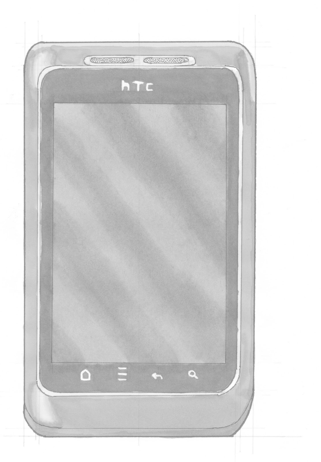
Fortunately mine was one of the ones which he seemed to like more, mainly due to their plain background, relatively large amount of work, limited use of photoshop and my placement of the logos. What he did say however was that, although I was one of about three people who got the logo aspect sort of right, adding to the drawings instead of distracting from them, the bars at the bottom could still be more discrete and the perspective of the HTC drawings could be improved slightly.
For the working drawings he seemed pleased with mine particularly the cheese grater and the Razor, both of which he liked the detailing of, for which he encouraged from the group a half applause, not quite as good as a full applause, but since only two others got a full applause and no one else a half applause, I felt very pleased.
So good though still improvements to be made for the final marking in April, however not as much needed as most others, so I'm really pleased with this first crit.
So my first assignment is due tomorrow and these are the pieces of work I have done for it. The brief was to create two presentation pages for two products, based on boxes and cylinders. These presentation sheets are to be mounted on foam board, and will accompany a folder with all/the best of the sheets of drawings I have done over the past month. However while this is an actual deadline, and the work will be worth 10% of the module, it won't be properly marked until April, tomorrow it will just be commented upon. But oh well, it was relatively fun doing this, even if I had to spend all of yesterday drawing in the library (the law library to be precise, don't ask why). So the images are below, I chose to do my HTC Wildfire S mobile and a Wilkinson Sword Razor I got given during freshers. The presentation sheets were put together on photoshop.
So probably the last of these Initial Ideas done on photoshop. The idea behind this is that of a relatively small vehicle, only about 1m high and 2.5 m long, that can operate remotely or independently to traverse difficult terrain and carry very large loads. This would be deployed with emergency forces to help with emergencies where heavy equipment or loading is necessary over rough terrain, such as in mountain rescue and earthquake and Landslide response. Of course this is only a very rough concept and idea which definitely needs improvement, but again it will look good in the workbook.
This time the initial sketch was on lined paper as that was all I had at the time.


