Saturday, 6 October 2012

Marvel Posters

Ok long time no posting but here is something I have been doing over the summer.

So I've been working on this for most of the summer on and off. I wanted to make a couple of poster ideas based around the dramatic use of lighting. The two best ideas I came up with were for Ironman and Thor, ergo the Marvel theme.
I made the Ironman poster into the wallpaper above

The Ironman poster started out with this first idea to have the light from the eyes and chest to imply the poster, but I felt that this was too weak and would not properly convey the film.

So by using reference images I was able to recreate parts of the armour and using gradients and the opacity tool I was able to create the effect that it was all lit by the lighting. I experimented with colouring the armour panels, but I preferred the grey scale version.

But I felt it was still lacking punch so I darkened the background to further emphasise the lighting.


The second poster, for Thor, my idea was to have him lit somehow, either by lightning or by his hammer, with the light fading into black away from the source. To accomplish that I first traced all the individual components from a reference photo.
I then adjusted the opacity of the various elements to create the lighting effect. For the eyes and the cloak, as they are such iconic parts of the Thor imagery I gave them colour to make them stand out.

 I experimented with several ways of emphasizing the light source with lightning in the background or with a halo around the hammer, but in the end I simply decided to leave it be as it carries all the drama and story it needs form me.

Saturday, 21 July 2012

Website Project-Planning

My last project from the first year is another graphics project. The brief for this project was to make a simple website using Adobe Flash. Like the previous project this would also be accompanied by a workbook explaining my process and progress.
I started off with a mind map exploring the different areas I would have to explore such as the user interface and any unique flash elements. 


 I then explored some different ideas for the topic of my website such as data flows, visualisations, space and physics(cern), but i settled on the idea below: mountaineering, as I have a fair amount of experience and photos I have taken.
 With the topic chosen I did some sketches to work out how to best display the information and to create an effective navigation system.
 In the end I settled with a mixture of two of the ideas by using a map idea with pictures accessed by a mouse hover over on the peaks.

Finally the last bit of planning was working out how many pages I would need. My first try gave me 52, far too many. I was able to reduce this to just 13, much better.

Next time it will be the practical making of the website.

Monday, 16 July 2012

Singapore Experience Design- Conclusion

OK so I have been somewhat lazy recently and haven't been updating this at all so here's to a new invigorated initiative, starting off with a couple of large posts finishing off what I did at Brunel.

After the progress shown in the last post (here) a number of projects began simultaneously. One of these was the finalisation of the logo for our 'company' (group). The idea we went with was the one above with 'rumah' meaning home in Malay, one of the major languages of Singapore. The logo references the 'pod' motif of the design with the pod formed by the union of the 'h' and the 'u' in the logo.

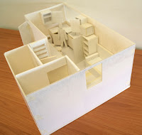
Another project I was involved with was the creation of a scale model of the design, made out of foamboard, card, plastic and lots of tape. This was done by myself and another group member over a number of days.
 The model featured a removable roof and top floor.

While this was being done others in the group were working on creating 3D CAD models in Solidworks on the computer, with the two groups in contact to finalise design details. When both these were done we began collating all the work to put together the workbook.

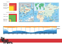
For the workbook I made some more graphics to go with the ones I had already made (Rig Graphics and Infographics) creating a hierarchy of needs with the bold text showing need particularly necessary for this project.
I also created a number of potential cover ideas based on different possible styles for the inside of the book
In the end a different idea proposed by someone else was chosen that we agreed looked better.

Before we could present the workbook we first had to give a verbal presentation to our peers on the course. The presentation went well and here are a selection of the slides from that.

 With the presentation out of the way we were able to concentrate on finishing the workbook, which was presented to one of our lecturers and a representative from Building Trust International. Again here are a sample of the pages.
After the small presentation feedback was given to the group and it was very positive. The Building Trust International rep said that we had exceeded both their expectations and the brief and the lecturer was equally positive.

Finally after the presentation some other members of the group put together a single board summarising our project on a single page for Building Trust International to use.

So a good finish to a fun, if stressful at times, project and a good end to the first part of the module.