Showing posts with label Ink. Show all posts

Thursday, 24 May 2012

London Artwork

Ok so a little divergence from the Singapore Project, some artwork. Now that my exams are finished and it's getting to the end of term, I have been using my location to explore some parts of London I haven't really seen much of. On Tuesday, as it was so nice I decided to look around Hyde Park and Kensington Gardens.
While there I did this watercolour of a small shelter in Kensington Gardens. A6, took about 1 hour.
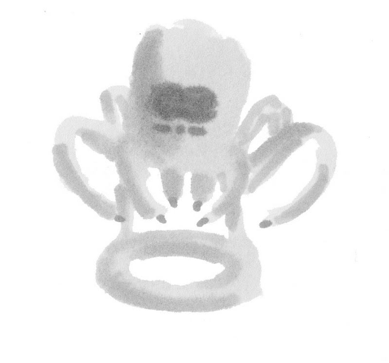
After that I went to see Russel Howard's Good News being recorded and while I waited for some friends I did this quick ink sketch just outside Hammersmith Station.

Friday, 18 May 2012

Singapore Experience Design- Final Design Sketch

This is a render of the final design for the Singapore Migrant Worker Accommodation project.
It has two stories, and is made of a wood called Glulam, which is made of the bits of wood that are normally discarded. It would be modular, this is just one unit but they could be stacked into tower blocks. It would be placed on or near to the work site but the construction company.

Saturday, 4 February 2012

Eco-Design Ideas

Sorry for the long delay,its been a bit of a tricky week. These are just some quick ideas generated in a group idea session for the eco-design brief: Less is More
Sorry it's faint, its clearer when enlarged (click the image). Interestingly when a lecturer came round to see how we were doing, she commented that she found my sketching style similar to the work of Quentin Blake (best known for his illustrations of Roald Dahl novels), I can kind of see what she means, although it was never my intent to imitate his style, I guess sometimes these just happen.

Friday, 9 December 2011

Cocktail Maker- Mixing Sketching and Photoshop

A couple more concepts for Graphics, to help flesh out the workbook. These are two designs where I show a couple of the quick ways I can render concepts. I started both designs with a simple pencil and pen isometric drawing.
Then I added marker rendering to the sketch adding tone and texture to help define both its colour form and material.
Then finally I used the original drawing in Photoshop to create this colour render of the the product.

The second design was done in exactly the same way as the one above. To quicken the Photoshop stage I used my graphics tablet as I am quicker and more comfortable with it than with either the mouse of touchpad.

Wednesday, 30 November 2011

Cocktail Maker

Sorry I haven't posted in a while but I'm back on track now so....
For my graphics project I am making an automatic Cocktail Maker. It will be made in Photoshop and presented as a poster and workbook. Below are some initial ideas for the design in ink.
 The next few designs are just in the marker pens are are supposed to be only vague ideas.

Wednesday, 23 November 2011

Sci-Fi Space Ship

Today I had a free day and other than meeting a friend from school whi had come up for an interview, nothing really happened, so lots of work then...well not really. Today I basically had, as far as the work had to go, a creative block. I was still able to get some maths and electronics done, so not a day wasted, but not a great day either. So in an attempt to get some creativity back into me I decided to do something I have not done in a while and embrace creativity wholely, abandoning reality. To make something completely imaginative.
So this is the resulting design (please click for a larger view it looks much better), a sci-fi sort space ship/plane. I chose to do it following the advice of the artist Doug Chiang, an exceptional concept designer whose book Mechanika I own. Doug Chiang is a multi award winning designer (2 BAFTAs and an Oscar) who has designed for movies such as Star Wars Episode I (as lead designer), Episode II, War of the Worlds, Terminator 2 and Forrest Gump. I would recommned his book Mechanika to any designer as it features excellent tips on using markers and photoshop and creating good design.

Friday, 18 November 2011

Foam Objects Critique

Today was the deadline and critique for the foam objects I have been slowly making over the past four weeks. And it went relatively well, in my opinion at least.
 To recap, the assignment was to create two objects:
  • An everyday object with a historic design style incorporated into the design
  • And a mystery object from a 200 word description from a classmate.
The first object I chose was a mug in the style of the Gugenheim Museum (called deconstructivism). This was quite tricky as it involves lots of flat surfaces flowing into one another with sharp well defined edges, not too easy in foam. Also the whole model had to be cut in half and across the bottom to allow me to remove the inner part of the mug and then glued back together. However I was pleased with the final design and finish on the model, but it could be improved with more time.
 Below are also the drawings I did to come up with and help build the design in some initial ideas and two orthographic drawings.

The second object was done from a description (see it here) my classmate gave me. This is the object I made from that description, Again I am pleased with how it has come out, but it needs more time to be finished properly.

 Again here are a couple of sketches and an orthographic drawing from the description.
 And this here is a photo of the actual object itself, a handheld label maker. So as you can see, not really what I made at all, but the purpose of the exercise was to make what was described, and to that end I think I did quite well.

So to the crit(ique) itself. We each sat at the tables our group's have been allocated (I'm X13) and we got out our models and development drawings. Then as a whole class we gathered around each table in turn and each person presented their models and then Rob (the lecturer) gave his comments and possible improvements for each piece, getting individuals to comment on their own and others work as well in a sort of peer review. 
When it came to my turn Rob agreed with me that the finish could be improved on the mug, but he seemed pleased with the design as it is challenging and also was the only model that was deconstructivism (the others were all Art Deco/Nouveu, Streamlined or Post-Modernism, with a few being Memphis, Natural or Bauhaus). He then suggest it be passed round the class so other students could see it better while he examined my other object. Again he agreed that the finish could be better but other than that he seemed very happy and praised my classmate for picking an interesting and unusual object. There were also some other very good objects such as a Memphis gorilla, a Natural vase and a Streamlined Coke can.

So another pretty good crit and at last a rest from a pretty stressful week so I can now relax and enjoy the weekend!